Section 12.5 of the book [1] is the source of these exercises. The Python code follows the book’s Chapter 12 lab notebook, with scikit-learn [2] in place of the ISLP package. The R code uses base R’s prcomp, kmeans and hclust.
Arrest rates for violent crimes in 50 US states in 1973 make up the USArrests data [1, Sec. 12.5.1]. The data are in data/usarrests.csv, one row per state. The columns are:
Murder: murder arrests per \(100{,}000\) residents.
Assault: assault arrests per \(100{,}000\) residents.
Rape: rape arrests per \(100{,}000\) residents.
UrbanPop: the percentage of the state’s population that lives in cities.
ExrExercise 1 (Lab: the scale of each arrest variable)
The variables are on very different scales: the standard deviation of Assault is 83.3, about 19 times the 4.4 of Murder. A method that compares the variables by their raw sizes would be dominated by Assault, which is the reason to standardize them before the next exercise.
ExrExercise 2 (Lab: murder and assault arrest rates)
Exercise 2 (Lab: murder and assault arrest rates) Use the USArrests data. What is the sample correlation between Murder and Assault?
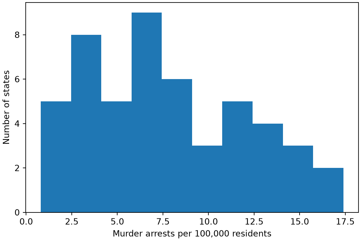
import matplotlib.pyplot as pltfig, ax = plt.subplots(figsize=(6, 4), layout="constrained")ax.hist(arr_eda_py["Murder"], bins=10);ax.set_xlabel("Murder arrests per 100,000 residents");ax.set_ylabel("Number of states");plt.show()
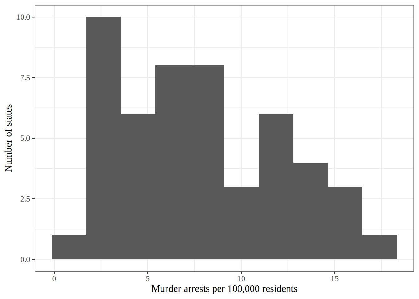
library(ggplot2)# nolint: undesirable_function_lintermurder_histogram<-arr_eda_r|>ggplot()+aes(Murder)+geom_histogram(bins =10)+labs(x ="Murder arrests per 100,000 residents", y ="Number of states")murder_histogram
Figure 1 shows that most states have a low or middle number of murder arrests per 100,000 residents.
I chose 10 bins, which is 5 states per bar on average. Far fewer bins would hide the shape inside a few wide bars, and far more would leave most bars with one or two states, so the outline would look ragged. That is why 10 is a compromise between the two.
ExrExercise 4 (Lab: murder against assault arrest rates)
Exercise 4 (Lab: murder against assault arrest rates) Use the USArrests data. Draw a scatterplot of Murder against Assault.
TipHint
Draw a scatterplot of one column against another, as in the plot of acceleration against horsepower in the primer.
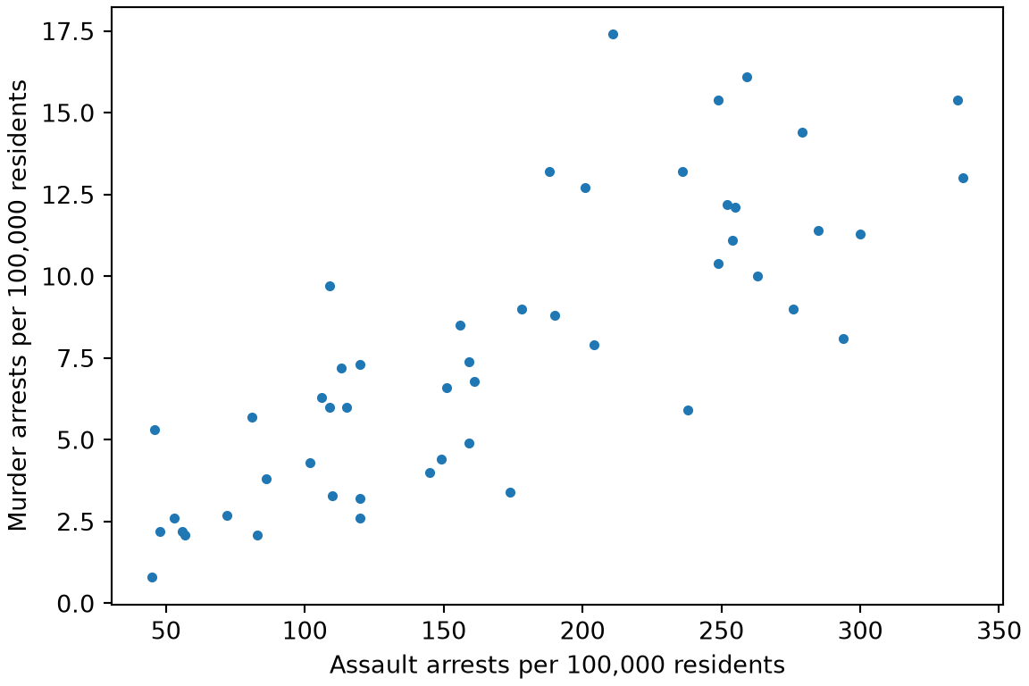
fig, ax = plt.subplots(figsize=(6, 4), layout="constrained")ax.scatter(arr_eda_py["Assault"], arr_eda_py["Murder"], s=10);ax.set_xlabel("Assault arrests per 100,000 residents");ax.set_ylabel("Murder arrests per 100,000 residents");plt.show()
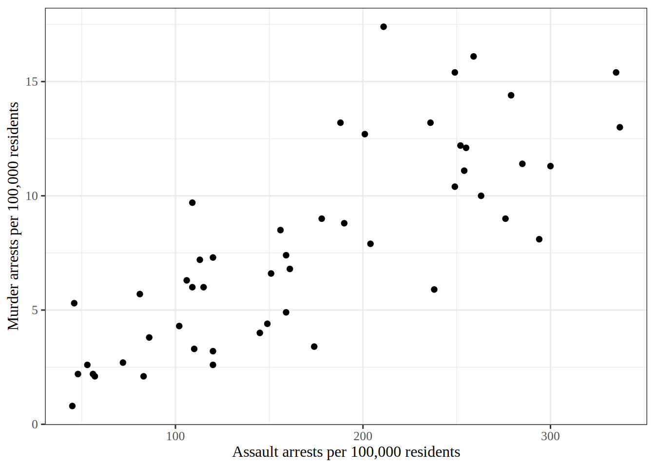
murder_assault_plot<-arr_eda_r|>ggplot()+aes(Assault, Murder)+geom_point()+labs( x ="Assault arrests per 100,000 residents", y ="Murder arrests per 100,000 residents")murder_assault_plot
Figure 2 shows murder arrests rising with assault arrests.
The points follow a rising band, which matches the positive correlation of the previous exercise. Because the two variables move together, a few directions in the plane carry most of the variation, and that is what principal components find.
Exercise 5 (Lab: standardize the arrests data) Standardize the four variables of the USArrests data [1]: the murder, assault and rape arrest rates per \(100{,}000\) residents of each of the \(50\) US states, and the percentage of each state’s population that lives in cities.
Each standardized variable should have mean\(0\) and standard deviation\(1\). The largest absolute column mean is 0 in the R run and 0 in the Python run. The smallest and largest standard deviations are 1 and 1 in the R run, whose scale divides by \(n - 1\). They are 1 and 1 in the Python run, whose StandardScaler divides by \(n\).
4 Principal components
ExrExercise 6 (Lab: find the first principal component)
Exercise 6 (Lab: find the first principal component) Find the first principal component of the standardized USArrests data from Exercise 5, and report its loading on each of the four variables.
The sign of a principal component is arbitrary, so the signs of the loadings can differ between libraries.
The loadings of the first component have absolute values 0.54 on Murder, 0.58 on Assault, 0.28 on UrbanPop and 0.54 on Rape in the R run. The Python run gives 0.54, 0.58, 0.28 and 0.54.
ExrExercise 7 (Lab: find the proportion of variance explained)
Exercise 7 (Lab: find the proportion of variance explained) Find the proportion of the variance of the standardized USArrests data from Exercise 5 that each principal component explains.
The first component explains 62% of the variance in the R run and 62% in the Python run. The second explains 24.7% in the R run and 24.7% in the Python run.
5 Clustering
ExrExercise 8 (Lab: cluster the states with k-means)
Exercise 8 (Lab: cluster the states with k-means) Cluster the standardized USArrests data from Exercise 5 into \(3\) groups with k-means, starting the algorithm from \(20\) random sets of centers and keeping the best result, and report the size of each cluster.
TipHint
The KMeans estimator has a setting for the number of random starts, and its labels_ holds the cluster of each row. In R, kmeans() has an nstart setting for the number of random starts, and its cluster component holds the number of the group of each row.
The cluster sizes are 13, 17, 20 in the R run and 14, 16, 20 in the Python run. The numbering of the clusters is arbitrary, so the sizes are listed from smallest to largest. The two runs can disagree, because k-means finds a local optimum that depends on the random starting centers.
ExrExercise 9 (Lab: cluster the states hierarchically)
Exercise 9 (Lab: cluster the states hierarchically) Cluster the standardized USArrests data from Exercise 5 with complete linkage and Euclidean distance, cut the dendrogram into \(3\)clusters, and report the size of each cluster.
arrests_dist<-dist(arrests_z)tree_r<-hclust(arrests_dist, method ="complete")hc_labels_r<-cutree(tree_r, k =3)hc_counts_r<-table(hc_labels_r)hc_sizes_r<-as.vector(hc_counts_r)|>sort()hc_sizes_r
[1] 8 11 31
The cluster sizes are 8, 11, 31 in the R run and 8, 11, 31 in the Python run.
6 Gene expression data
ExrExercise 10 (Lab: find the principal components of gene expression)
Exercise 10 (Lab: find the principal components of gene expression) The NCI60 data [1] hold how active each of \(6830\) genes is in each of \(64\) cancer samples. Standardize each gene to have sample mean\(0\) and standard deviation\(1\), then compute the principal components of the samples. Report the proportion of the variance explained by each of the first \(5\) components.
The first component explains 11.4% of the variance in the R run and 11.4% in the Python run. The first five together explain 31.8% in the R run and 31.8% in the Python run, so a few components carry a modest share of the information in \(6830\) genes.
ExrExercise 11 (Lab: cluster the samples hierarchically)
Exercise 11 (Lab: cluster the samples hierarchically)Cluster the standardized samples from Exercise 10 with complete linkage and Euclidean distance, cut the dendrogram into \(4\)clusters, and report the size of each cluster.
nci_dist<-dist(nci_z)nci_tree<-hclust(nci_dist, method ="complete")nci_hc_r<-cutree(nci_tree, k =4)nci_hc_counts<-table(nci_hc_r)nci_hc_sizes_r<-as.vector(nci_hc_counts)|>sort()nci_hc_sizes_r
[1] 7 8 9 40
The cluster sizes are 7, 8, 9, 40 in the R run and 7, 8, 9, 40 in the Python run.
ExrExercise 12 (Lab: cluster the samples with k-means)
Exercise 12 (Lab: cluster the samples with k-means)Cluster the standardized samples from Exercise 10 into \(4\) groups with k-means, starting the algorithm from \(20\) random sets of centers and keeping the best result, and report the size of each cluster.
TipHint
The KMeans estimator has a setting for the number of random starts, and its labels_ holds the cluster of each row, as in Exercise 8. In R, kmeans() has an nstart setting for the number of random starts, and its cluster component holds the number of the group of each row.
ExrExercise 13 (Lab: compare the k-means and hierarchical clusters)
Exercise 13 (Lab: compare the k-means and hierarchical clusters) Compare the sizes of the k-meansclusters from Exercise 12 with the sizes of the hierarchical clusters from Exercise 11.
Solution 13. The k-meanscluster sizes are 8, 9, 20, 27 in the R run and 9, 9, 19, 27 in the Python run, against 7, 8, 9, 40 and 7, 8, 9, 40 for the hierarchical clusters. Complete linkage puts 40 of the \(64\)samples in one cluster, while k-means spreads them more evenly. The k-means sizes can differ between the two runs, because k-means finds a local optimum that depends on its random starting centers.
References
[1]
G. James, D. Witten, T. Hastie, R. Tibshirani, and J. Taylor, An introduction to statistical learning: With applications in Python. Springer, 2023. doi: 10.1007/978-3-031-38747-0.
[2]
F. Pedregosa et al., “Scikit-learn: Machine learning in Python,”Journal of Machine Learning Research, vol. 12, pp. 2825–2830, 2011, Available: https://jmlr.org/papers/v12/pedregosa11a.html