# one unbroken string, so that link checkers test the whole URL:
url <- "https://regression.ucsf.edu/sites/g/files/tkssra16191/files/wysiwyg/home/data/wcgs.dta" # nolint: line_length_linter.
wcgs <- haven::read_dta(url)Exploratory Data Analysis
1 Introduction
Before fitting a model, it is good practice to explore and summarize the data. Exploratory data analysis (EDA) serves several purposes:
- understanding the distribution of each variable individually;
- detecting unusual values, outliers, and missing data;
- identifying patterns and relationships among variables;
- motivating choices of model structure, such as transformations;
- providing context for interpreting model results.
This page is adapted from (Vittinghoff et al. 2012, chap. 2).
1.1 The WCGS data
This page illustrates exploratory data analysis using data from the Western Collaborative Group Study (WCGS) (Rosenman et al. 1975). Vittinghoff et al. (2012, 9) describe the study this way:
The Western Collaborative Group Study (WCGS) was a large epidemiological study designed to investigate the association between the “type A” behavior pattern and coronary heart disease (CHD).
1.2 Study design
The WCGS began in 1960 with 3,524 male volunteers employed by 11 California companies. Participants were 39 to 59 years old and free of heart disease, as determined by electrocardiogram. After the initial screening, various exclusions reduced the study population to 3,154 men and the number of companies to 10. The cohort comprised both blue- and white-collar employees. Average follow-up was 8.5 years, with repeat examinations.
This description paraphrases the help page for the wcgs dataset in the faraway R package.
At baseline, the study collected:
- socio-demographic characteristics: age, education, marital status, income, and occupation;
- physical and physiological measurements: height, weight, blood pressure, electrocardiogram, and corneal arcus;
- biochemical measurements: cholesterol and lipoprotein fractions;
- medical and family history, and use of medications;
- behavioral data: the Type A interview, smoking, exercise, and alcohol use.
Later surveys added anthropometry, triglycerides, the Jenkins Activity Survey, and caffeine use.
1.3 Loading the data
The WCGS data are distributed with Vittinghoff et al. (2012) on the book’s companion website, as a Stata file that R can read directly:
The rmb R package includes the same file, which these notes use so that rendering does not depend on the website. haven::as_factor() converts the Stata value labels to factors:
Show R code
# attach a descriptive label to each variable;
# gtsummary tables print these labels instead of the column names:
wcgs_labels <- c(
  age = "Age (years)",
  chol = "Cholesterol (mg/dL)",
  sbp = "Systolic BP (mmHg)",
  dbp = "Diastolic BP (mmHg)",
  bmi = "BMI (kg/m^2)",
  weight = "Weight (lbs)",
  ncigs = "Cigarettes per day",
  chd69 = "CHD event by 1969",
  smoke = "Current smoker",
  arcus = "Arcus senilis",
  dibpat = "Behavioral pattern (A/B)",
  behpat = "Behavioral pattern (A1/A2/B3/B4)",
  wghtcat = "Weight category",
  agec = "Age group"
)
for (var in names(wcgs_labels)) {
  attr(wcgs[[var]], "label") <- wcgs_labels[[var]]
}
The dataset has one row per participant:
dplyr::glimpse(wcgs)
#> Rows: 3,154
#> Columns: 22
#> $ age      <dbl> 50, 51, 59, 51, 44, 47, 40, 41, 50, 43, 59, 54, 48, 39, 49, 5…
#> $ arcus    <dbl> 1, 0, 1, 1, 0, 0, 0, 0, 1, 0, 0, 0, 0, 0, 0, 1, 0, 0, 0, 0, 1…
#> $ behpat   <fct> A1, A1, A1, A1, A1, A1, A1, A1, A1, A1, A1, A1, A1, A1, A1, A…
#> $ bmi      <dbl> 31.3210, 25.3286, 28.6939, 22.1487, 22.3130, 27.1177, 23.2420…
#> $ chd69    <fct> No, No, No, No, No, No, No, No, No, No, No, No, No, Yes, No, …
#> $ chol     <dbl> 249, 194, 258, 173, 214, 206, 190, 212, 130, 233, 181, 214, 2…
#> $ dbp      <dbl> 90, 74, 94, 80, 80, 76, 78, 84, 70, 80, 86, 76, 78, 74, 80, 7…
#> $ dibpat   <fct> Type A, Type A, Type A, Type A, Type A, Type A, Type A, Type …
#> $ height   <dbl> 67, 73, 70, 69, 71, 64, 70, 70, 71, 68, 72, 67, 71, 70, 73, 7…
#> $ id       <dbl> 2343, 3656, 3526, 22057, 12927, 16029, 3894, 11389, 12681, 10…
#> $ lnsbp    <dbl> 4.88280, 4.78749, 5.06259, 4.83628, 4.83628, 4.75359, 4.80402…
#> $ lnwght   <dbl> 5.29832, 5.25750, 5.29832, 5.01064, 5.07517, 5.06259, 5.08760…
#> $ ncigs    <dbl> 25, 25, 0, 0, 0, 80, 0, 25, 0, 25, 10, 0, 20, 0, 4, 0, 0, 20,…
#> $ sbp      <dbl> 132, 120, 158, 126, 126, 116, 122, 130, 112, 120, 130, 118, 1…
#> $ smoke    <fct> Yes, Yes, No, No, No, Yes, No, Yes, No, Yes, Yes, No, Yes, No…
#> $ t1       <dbl> -1.633353, -4.063366, 0.639729, 1.121768, 2.425011, -0.787520…
#> $ time169  <dbl> 1367, 2991, 2960, 3069, 3081, 2114, 2929, 3010, 3104, 2861, 2…
#> $ typchd69 <dbl> 0, 0, 0, 0, 0, 0, 0, 0, 0, 0, 0, 0, 0, 1, 0, 0, 0, 0, 0, 0, 0…
#> $ uni      <dbl> 0.4860738, 0.1859543, 0.7277991, 0.6244636, 0.3789776, 0.7355…
#> $ weight   <dbl> 200, 192, 200, 150, 160, 158, 162, 160, 195, 187, 206, 152, 1…
#> $ wghtcat  <fct> 170-200, 170-200, 170-200, 140-170, 140-170, 140-170, 140-170…
#> $ agec     <fct> 46-50, 51-55, 56-60, 51-55, 41-45, 46-50, 35-40, 41-45, 46-50…
2 Summarizing a single variable
2.1 Measures of center
2.2 Measures of spread
The standard deviation has the same units as the observations, which makes it easier to interpret than the variance, whose units are squared.
With an odd number of observations, the sample 0.5 quantile equals the sample median; with an even number they can differ, because the median averages the two middle order statistics. Software packages compute quartiles with different quantile definitions, so they can disagree slightly for the same data (quantile conventions); R’s quantile(type = 1) matches these notes’ definition, and R’s default, type = 7, interpolates.
2.3 Summary statistics in R
The summary() function reports the minimum, quartiles, mean, maximum, and number of missing values in one call; its quartiles use R’s default interpolating quantile rule (type = 7), so they can differ slightly from Definition 5:
summary(wcgs$chol)
#>    Min. 1st Qu.  Median    Mean 3rd Qu.    Max.     NAs
#>     103     197     223     226     253     645      12
For a formatted table of several variables at once, gtsummary::tbl_summary() is useful (Table 1).
wcgs |>
  dplyr::select(age, chol, sbp, dbp, bmi, weight) |>
  gtsummary::tbl_summary(
    statistic = list(
      gtsummary::all_continuous() ~
        "{mean} ({sd}); {median} [{p25}, {p75}]"
    ),
    digits = gtsummary::all_continuous() ~ 1
)| Characteristic | N = 3,1541 |
|---|---|
| Age (years) | 46.3 (5.5); 45.0 [42.0, 50.0] |
| Cholesterol (mg/dL) | 226.4 (43.4); 223.0 [197.0, 253.0] |
| Unknown | 12 |
| Systolic BP (mmHg) | 128.6 (15.1); 126.0 [120.0, 136.0] |
| Diastolic BP (mmHg) | 82.0 (9.7); 80.0 [76.0, 86.0] |
| BMI (kg/m^2) | 24.5 (2.6); 24.4 [23.0, 25.8] |
| Weight (lbs) | 170.0 (21.1); 170.0 [155.0, 182.0] |
| 1 Mean (SD); Median [Q1, Q3] | |
2.4 Binary and categorical variables
For categorical variables with more than two levels, the natural descriptive statistics are the count of observations in each category and the corresponding proportions (Table 2).
Show R code
wcgs |>
  dplyr::select(chd69, smoke, dibpat, behpat, wghtcat) |>
gtsummary::tbl_summary()| Characteristic | N = 3,1541 |
|---|---|
| CHD event by 1969 | 257 (8.1%) |
| Current smoker | 1,502 (48%) |
| Behavioral pattern (A/B) | |
| Type B | 1,565 (50%) |
| Type A | 1,589 (50%) |
| Behavioral pattern (A1/A2/B3/B4) | |
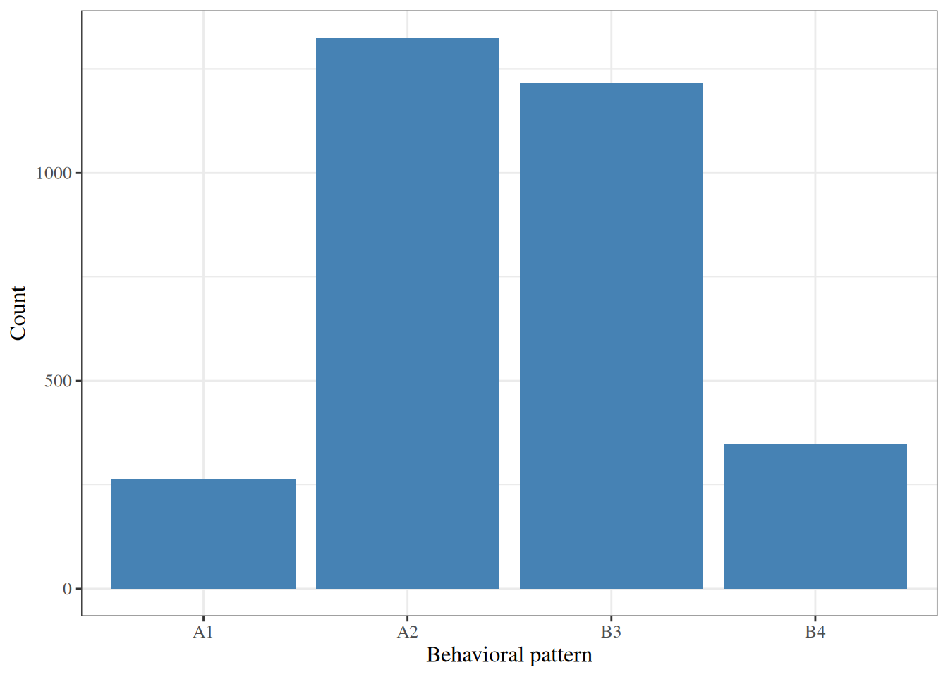
| A1 | 264 (8.4%) |
| A2 | 1,325 (42%) |
| B3 | 1,216 (39%) |
| B4 | 349 (11%) |
| Weight category | |
| < 140 | 232 (7.4%) |
| 140-170 | 1,538 (49%) |
| 170-200 | 1,171 (37%) |
| > 200 | 213 (6.8%) |
| 1 n (%) | |
3 Graphical methods
Graphs can reveal features of a distribution that summary statistics miss, such as skewness, multiple peaks, and outliers. Different types of graph suit different types of variable.
3.1 Histograms
The intervals are often called bins.
Show R code
wcgs |>
  ggplot2::ggplot() +
  ggplot2::aes(x = chol) +
  ggplot2::geom_histogram(bins = 30, fill = "steelblue", color = "white") +
  ggplot2::labs(x = "Cholesterol (mg/dL)", y = "Count")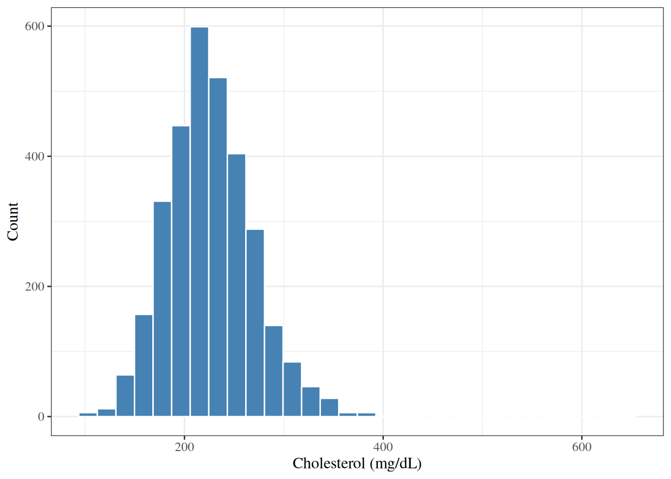
Figure 1 shows a single-peaked distribution with a longer right tail than left tail: 97% of the values lie between 150 and 350 mg/dL, but the largest value is 645 mg/dL.
3.2 Density plots
Show R code
wcgs |>
  ggplot2::ggplot() +
  ggplot2::aes(x = chol) +
  ggplot2::geom_density(fill = "steelblue", alpha = 0.5) +
  ggplot2::labs(x = "Cholesterol (mg/dL)", y = "Density")
3.3 Box plots
The \(1.5 \times \text{IQR}\) whisker rule is the default in R’s boxplot() and ggplot2::geom_boxplot(); other software and authors use other rules, such as whiskers that run to the minimum and maximum.
Show R code
wcgs |>
  ggplot2::ggplot() +
  ggplot2::aes(y = chol) +
  ggplot2::geom_boxplot(fill = "steelblue") +
  ggplot2::labs(y = "Cholesterol (mg/dL)") +
  ggplot2::theme(axis.text.x = ggplot2::element_blank())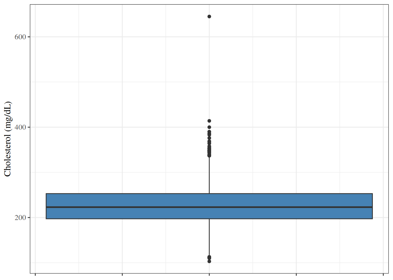
3.4 Bar charts
Show R code
3.5 Normal quantile-quantile plots
Show R code
wcgs |>
  ggplot2::ggplot() +
  ggplot2::aes(sample = chol) +
  ggplot2::stat_qq() +
  ggplot2::stat_qq_line(color = "red") +
  ggplot2::labs(x = "Standard Gaussian quantiles", y = "Cholesterol (mg/dL)")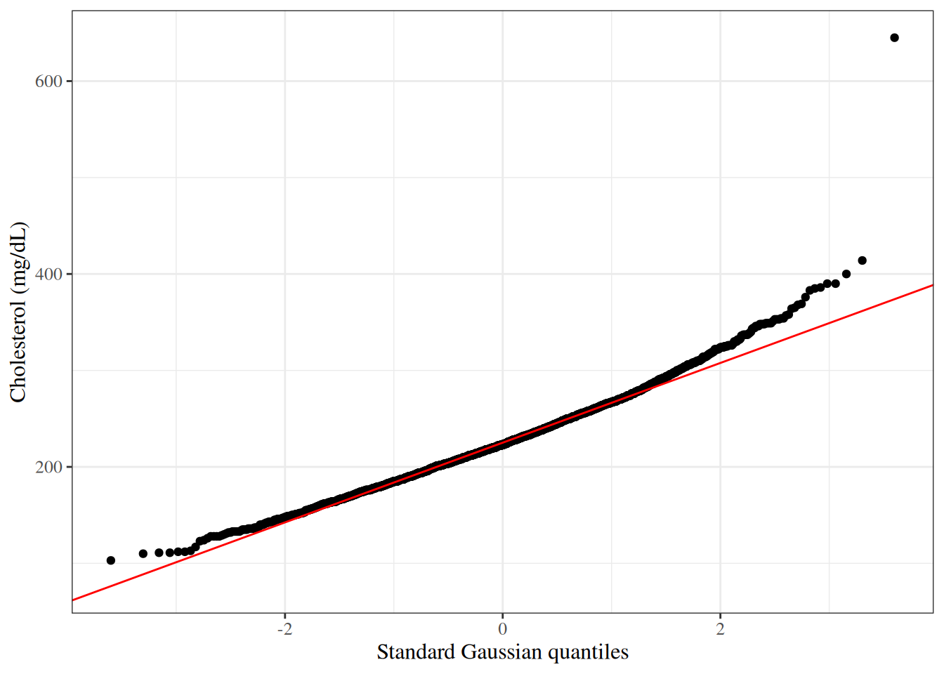
In Figure 5, the points curve above the reference line at the right, which matches the long right tail in Figure 1.
4 Bivariate relationships
4.1 Two continuous variables
Show R code
wcgs |>
  ggplot2::ggplot() +
  ggplot2::aes(x = sbp, y = chol) +
  ggplot2::geom_point(alpha = 0.3) +
  ggplot2::geom_smooth(method = "lm", se = TRUE, color = "red") +
  ggplot2::labs(x = "Systolic BP (mmHg)", y = "Cholesterol (mg/dL)")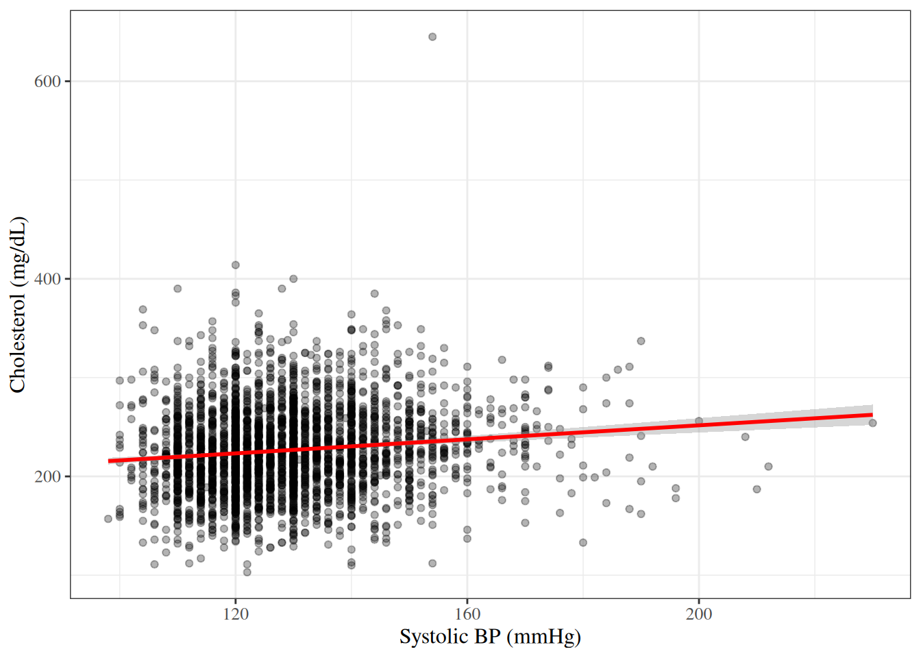
ProofProof
Proof. Write \(a_i \stackrel{\text{def}}{=}x_i - \bar x\) and \(b_i \stackrel{\text{def}}{=}y_i - \bar y\), so that \(r = \sum_i a_i b_i / \mathopen{}\left(\sqrt{\sum_i a_i^2} \sqrt{\sum_i b_i^2}\right)\mathclose{}\). The Cauchy–Schwarz inequality states that \(\mathopen{}\left|\sum_i a_i b_i\right|\mathclose{} \le \sqrt{\sum_i a_i^2} \sqrt{\sum_i b_i^2}\), with equality if and only if one of the vectors \((a_1, \ldots, a_n)\) and \((b_1, \ldots, b_n)\) is a scalar multiple of the other. Dividing both sides by the (positive) right-hand side gives \(\mathopen{}\left|r\right|\mathclose{} \le 1\).
Equality \(\mathopen{}\left|r\right|\mathclose{} = 1\) therefore holds if and only if \(b_i = c \, a_i\) for some constant \(c \ne 0\) and every \(i\), that is, \(y_i = \bar y + c(x_i - \bar x)\): the points lie on a line with slope \(c\). Then \(\sum_i a_i b_i = c \sum_i a_i^2\) has the sign of \(c\), so \(r = 1\) when \(c > 0\) and \(r = -1\) when \(c < 0\).
CautionCorrelation measures linear association only
Two variables can be strongly related and still have a correlation near zero, if the relationship is not linear. For example, if \(y_i = x_i^2\), the \(x_i\) are symmetric around 0, and the \(\mathopen{}\left|x_i\right|\mathclose{}\) are not all equal, then \(r = 0\), although \(y\) is a function of \(x\). Correlation also does not imply causation.
4.2 A continuous variable by a categorical variable
Side-by-side box plots compare the distribution of a continuous variable across the groups defined by a categorical variable (Figure 7 and Figure 8).
Show R code
wcgs |>
  ggplot2::ggplot() +
  ggplot2::aes(x = smoke, y = chol, fill = smoke) +
  ggplot2::geom_boxplot() +
  ggplot2::labs(x = "Current smoker", y = "Cholesterol (mg/dL)") +
  ggplot2::theme(legend.position = "none")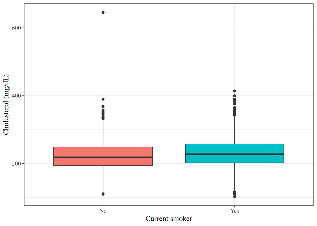
Show R code
wcgs |>
  ggplot2::ggplot() +
  ggplot2::aes(x = behpat, y = chol, fill = behpat) +
  ggplot2::geom_boxplot() +
  ggplot2::labs(x = "Behavioral pattern", y = "Cholesterol (mg/dL)") +
  ggplot2::theme(legend.position = "none")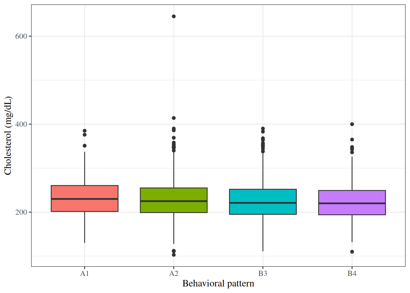
Table 3 computes summary statistics separately for each group.
Show R code
wcgs |>
  dplyr::select(chol, sbp, bmi, chd69) |>
  gtsummary::tbl_summary(
    by = chd69,
    statistic = list(
      gtsummary::all_continuous() ~
        "{mean} ({sd})"
    ),
    digits = gtsummary::all_continuous() ~ 1
  ) |>
gtsummary::add_overall()| Characteristic |
Overall N = 3,1541 |
No N = 2,8971 |
Yes N = 2571 |
|---|---|---|---|
| Cholesterol (mg/dL) | 226.4 (43.4) | 224.3 (42.2) | 250.1 (49.4) |
| Unknown | 12 | 12 | 0 |
| Systolic BP (mmHg) | 128.6 (15.1) | 128.0 (14.7) | 135.4 (17.5) |
| BMI (kg/m^2) | 24.5 (2.6) | 24.5 (2.6) | 25.1 (2.6) |
| 1 Mean (SD) | |||
4.3 Two categorical variables
5 Data transformations
When a continuous variable has a right-skewed distribution (a longer tail to the right than to the left), a logarithmic transformation often makes the distribution more symmetric. A log-transformed variable also has a multiplicative interpretation: an increase of 1 in \(\log(x)\) corresponds to multiplying \(x\) by \(e \approx 2.72\), because \(\log(x) + 1 = \log(e \cdot x)\).
The WCGS dataset already contains log-transformed versions of two variables:
-
lnsbp: \(\log(\text{SBP})\); -
lnwght: \(\log(\text{weight})\).
Show R code
wcgs |>
  ggplot2::ggplot() +
  ggplot2::aes(x = sbp) +
  ggplot2::geom_histogram(bins = 30, fill = "steelblue", color = "white") +
  ggplot2::labs(x = "Systolic BP (mmHg)", y = "Count")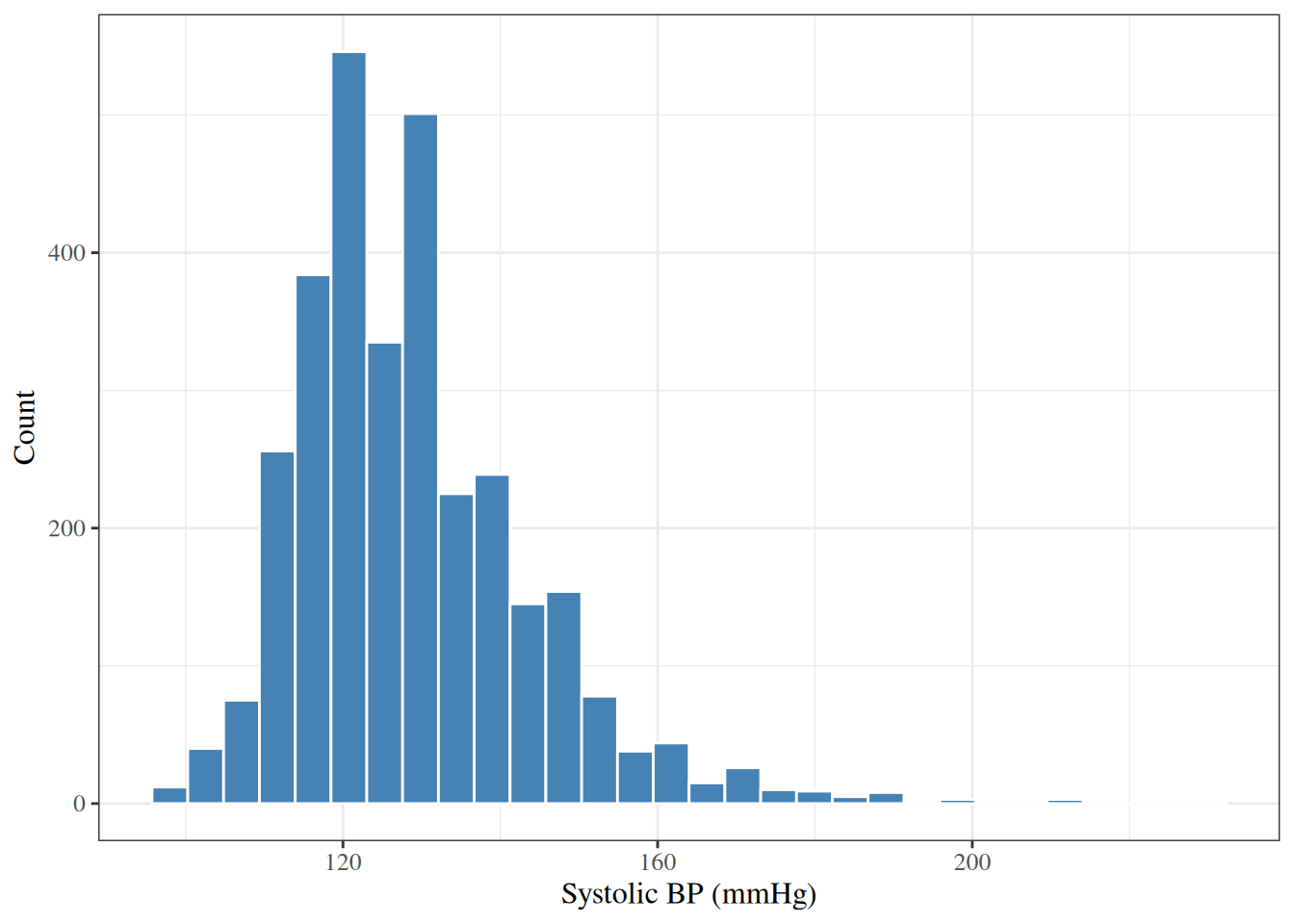
Show R code
wcgs |>
  ggplot2::ggplot() +
  ggplot2::aes(x = lnsbp) +
  ggplot2::geom_histogram(bins = 30, fill = "coral", color = "white") +
  ggplot2::labs(x = "log(Systolic BP)", y = "Count")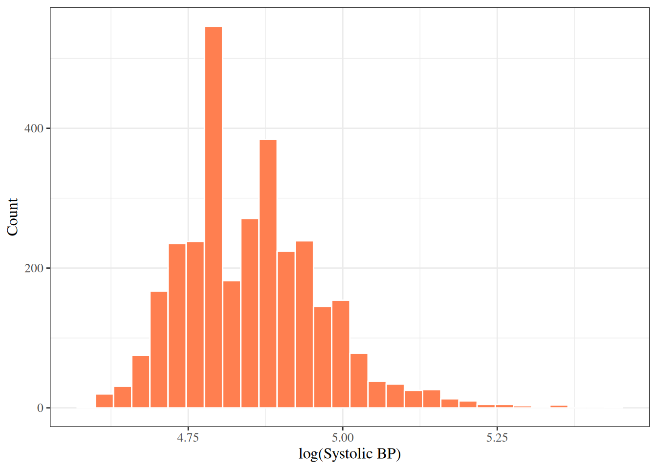
The log-transformed SBP is less skewed than the raw SBP (sample skewness 0.74 versus 1.2), but still not symmetric. Whether to transform a variable in a regression model depends on the assumptions of that model and on the scientific question.
6 An exploratory data analysis workflow
A typical exploratory data analysis proceeds as follows:
- Understand the dataset: the number of observations and variables, and each variable’s type.
-
Examine each variable individually:
- continuous: histogram, box plot, mean, SD, median, IQR;
- categorical: bar chart, frequency table;
- note missing values, unusual values, and outliers.
-
Examine relationships between variables:
- two continuous variables: scatter plot, correlation;
- continuous by categorical: side-by-side box plots, group means;
- two categorical variables: contingency table.
- Consider transformations for skewed continuous variables.
- Summarize the findings to guide model-building decisions.
Table 5 summarizes selected WCGS variables in one table.
Show R code
wcgs |>
  dplyr::select(
    age, chol, sbp, dbp, bmi, weight, ncigs,
    chd69, smoke, dibpat, behpat
  ) |>
gtsummary::tbl_summary()| Characteristic | N = 3,1541 |
|---|---|
| Age (years) | 45.0 (42.0, 50.0) |
| Cholesterol (mg/dL) | 223 (197, 253) |
| Unknown | 12 |
| Systolic BP (mmHg) | 126 (120, 136) |
| Diastolic BP (mmHg) | 80 (76, 86) |
| BMI (kg/m^2) | 24.39 (22.96, 25.84) |
| Weight (lbs) | 170 (155, 182) |
| Cigarettes per day | 0 (0, 20) |
| CHD event by 1969 | 257 (8.1%) |
| Current smoker | 1,502 (48%) |
| Behavioral pattern (A/B) | |
| Type B | 1,565 (50%) |
| Type A | 1,589 (50%) |
| Behavioral pattern (A1/A2/B3/B4) | |
| A1 | 264 (8.4%) |
| A2 | 1,325 (42%) |
| B3 | 1,216 (39%) |
| B4 | 349 (11%) |
| 1 Median (Q1, Q3); n (%) | |
References
Rosenman, Ray H, Richard J Brand, C David Jenkins, Meyer Friedman, Reuben Straus, and Moses Wurm. 1975. “Coronary Heart Disease in the Western Collaborative Group Study: Final Follow-up Experience of 8 1/2 Years.” JAMA 233 (8): 872–77. https://doi.org/10.1001/jama.1975.03260080034016.
Vittinghoff, Eric, David V Glidden, Stephen C Shiboski, and Charles E McCulloch. 2012. Regression Methods in Biostatistics: Linear, Logistic, Survival, and Repeated Measures Models. 2nd ed. Springer. https://doi.org/10.1007/978-1-4614-1353-0.